a color theory lesson, and a gray tile

If you want to know about color and how to use it in your art, I have an incredible book for you to work through: Color: A Workshop Approach, by David Hornung.

When I revised the color theory curriculum for the graphic communications students I taught at Waukesha County Technical College here in the southeast corner of Wisconsin, I incorporated many of the ideas I learned from David Hornung. I was never able to take one of his courses, but found his book one of the most enlightening practical art texts I have ever experienced. Really, I mean it.

It’s not only that he explains color in a way that you can understand it, the exercises bring the theoretical ideas to life. I know. I saw it happen with my students. In every class that I explained a concept, in a way that I imagined David Hornung would, and in every exercise, painted diligently with gouache (not a favorite for the computer-based design students I taught), bells rang, whistles blew, and eyes opened wide with new, a-ha! understanding.

I see that he also wrote Color: A Workshop for Artists and Designers, which, from what I can see, incorporates many of the same ideas. I just ordered it from Amazon. Here’s his website, in case you’re interested.

And so, whenever I read a new explanation of color theory, like the scant paragraph Beckah Krahula offers us on Day 22 of One Zentangle A Day, I have not only David Hornung, but piles of research and student experience to measure it by.

And I say: BLAAAHHHH. And Aaargh. Sorry Beckah, this chapter, about warm and cool color wheels, really falls short. If anything, it will confuse any novice to color, and certainly won’t foster a love of practicing warm and cool, or dull and bright, or dark and light color applications. And I don’t know what “boxed sets” you are referring to, but they don’t all include a warm and a cool selection for each of the primary colors. And your color wheel diagram doesn’t really show the difference, either.

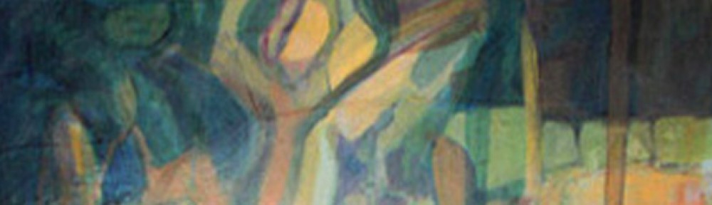
I am going to suspend further judgment until I read more. Maybe this was just a brief introduction, not intended to be in-depth (though any discussion of color requires some depth, in my humble opinion). And, the assignment is to learn two new tangles and use them… without color. So here is mine. It’s also kind of a “blaah” tile… maybe a reflection of what I read in the chapter?

day22

Tangles: tagh, tat, quandary, and diva dance.

honoring my home planet

The diva writes, “…this week’s challenge is our Mother Earth and whatever that means to you. However you’d like to interpret that.”

My interpretation is abstract. I think Zentangle is at its best as an abstract expression. The branch-like elements could be tree forms, but could also signify how the idea of honoring and caring for our planet has expanded and grown from that first April 22 in 1970. Or, they can be interpreted however you see them today. Abstraction is cool like that.

I am proud to live in the country, in fact, the state (Earth Day founder, U.S. Senator Gaylord Nelson was from Wisconsin) where it began. However, I am sad to be a citizen in a place where the bottom line so often “wins” over responsible stewardship of our beautiful, living, ever-interconnected home. I hope Earth Day will always remind us of our responsibility, and that we continue to do whatever is in our power to protect this planet, this life.

diva115

I used flux, tipple, lotus pods, isochor, diva dance, hibred, shattuck, sez, ix, dansk, and knightsbridge for this tangle. There are other wonderful interpretations for challenge no. 115 at the diva’s blog.

sepia tones

I enjoyed day 21 of One Zentangle A Day. It’s always fun to do betweed and paradox, and the chapter introduced working in sepia ink, which also proved to be a good exercise. So much so that I did two tiles! I used a dark brown colored pencil to shade with.

day21b

I used betweed, rick’s paradox, quandary (with black pearlz), strircles, printemps, and sez.


day21a


Tangles: flux with tipple, rick’s paradox with rounding, striping, sez, betweed, and mi2.

starry, starry

This week’s challenge from the diva Laura Harms has us seeing stars… or tangling them, that is. I chose to keep my star shape off-center, and partly off the tile, to make it more of a star suggestion. And, I’ve been wanting to try star map by Suzanne McNeill, ever since I saw the tangle used over on Margaret Bremner’s blog. I decided to do it in a reversed-out fashion, because I wanted my background to be really dark. It’s really fun to create large black areas with the Sakura Micron ink on a Zentangle tile.

diva114

I used oof, camelia, and star map.

square format

Here are a couple of new Zentangle creations I did in response to the diva’s challenge this week: the string is a square within a square within a square (and so on). My first was darker (shades of this cold beginning to spring?). The second, a little more leafy and bright. The take-home message for me is that while the foundation is the same, my tangle choices can take things in amazingly different directions.

diva113-2

From the inside out, the tangles are lanie, sláinte, eye-wa and fife.

diva113

For this, flux with tipple, striping, and leaflet.

Fun!

curvy + linear = curvilinear

On day 20 of One Zentangle A Day, Beckah Krahula has us working with sampson, n’zeppel, and jetties, which use curved lines, or curved lines placed on an X or on a grid of squares. I added a couple of additional curvilinear tangles because the tile seemed to be calling for them.

day20

I used sampson, jetties, n’zeppel, verdigogh, and flux with a little tipple.

There are more inspiring ideas and interpretations of the chapter over at the virtual book club.

The second assignment in the chapter was to experiment working on colored paper, using colored pencils for highlights and shadows. A key ingredient: choose colored pencils that are the same hue as the paper, just a lighter or darker value thereof. This is something I’ve worked on here and there, and enjoy immensely. Here are two cards I made on colored paper:

day20color

day20color2

analog to digital continuum

I just saw the phrase, “analog to digital continuum” on one of the blogs that I follow. I enjoy being one of the many who can claim existence in both worlds, and by default have been an active participant in the transition between them.

My career in graphic design and marketing communications began with a traditional fine arts degree, learned by standing at an easel and squishing paint colors together on a palette. My boyfriend at the time stole a cafeteria tray from the student union for me to use. Ever since then I have used old, worn out cookie sheets as palettes. Total analog. Squish out color, mix it, paint it onto a canvas. If you want someone to see your work, you invite them over or get a gallery to hang your work. I usually opted for the former, because I was so busy working for a paycheck that I didn’t accumulate enough work to hang.

So then I landed a job as an office manager with a print broker, and the rest is history. They asked me if I had used computers before. “Yes,” I said, thinking about the computer game I had played with the kids when I was a nanny/housekeeper, on their amazing contraption called an Apple. Could I type? ”Yes,” I lied, ”35 words a minute.”

They hired me on the spot, and I spent the weekend before work began learning how to type. On a typewriter. So I could go to work and use a computer. See the transition? There it was. A little bridge between analog and digital happened right there, in my life.

Before I knew it, I wasn’t just running their office, I was designing things with a page layout program. Leap ahead two years, I was designing things for a newspaper. Then I owned a design business, and soon I was working with four-color photographic images, getting them ready to be printed, going directly from a computer file to a printing press.

And now? Well, now I can type about 75 or 80 words a minute. I use computers all the time. In fact, I just used a digital camera to take a picture of an ink drawing I did by hand. I connected a wire from the camera to my computer and transferred the image. I opened my software (Photoshop) and adjusted the image saturation, the levels of dark and light, and the size and resolution of the image so that it not only looks a lot like the original, it can be shared, quickly and easily, with you.

It’s really amazing, when you think about it. I know when I link this image to the CZT diva Laura Harms’ blog, people from all over the world will see my interpretation of this week’s challenge, using the tuxedo tangle. It’s like I just invited you all over to see something I did by hand.

And that is the biggest thing of all: I did the drawing by hand. Because we all need to return to that kind of immediacy and wonder: that of seeing the ink flow out of the pen onto the lovely paper tile. The immediacy of my cat jumping up next to me and making my hand jump a little. The surprise and wonder at creating something new. Sure, I can do it a million times over on the computer, but when it is ink on a little piece of paper, it brings me back to why analog is important:

There is just one, I did it just now, and I cannot do it again. That is life.

Here is this week’s tile for the diva challenge #112:

diva112

I used tuxedo, mi2, knightsbridge and tripoli.You can check out the challenge and everyone’s work at the diva’s blog.